Client / Brand | New One Patisserie
Logo Design / Typography / VI System | Kim Huang
Package Design | Kim Huang
Oct. 2016
Now One Patisserie is a blockbuster French dessert shop that is well-known for Mille crepe cake. The owner insists on handmade crepes and fillings. Especially the layered cakes with distinct colors make every consumer full of love.
女王千層 法式手工甜點(Now one patisserie)主打道地的法式千層派,堅持手工製作餅皮和餡料。色彩繽紛的千層派蛋糕, 少女心完全大噴發, 擄獲甜食控。
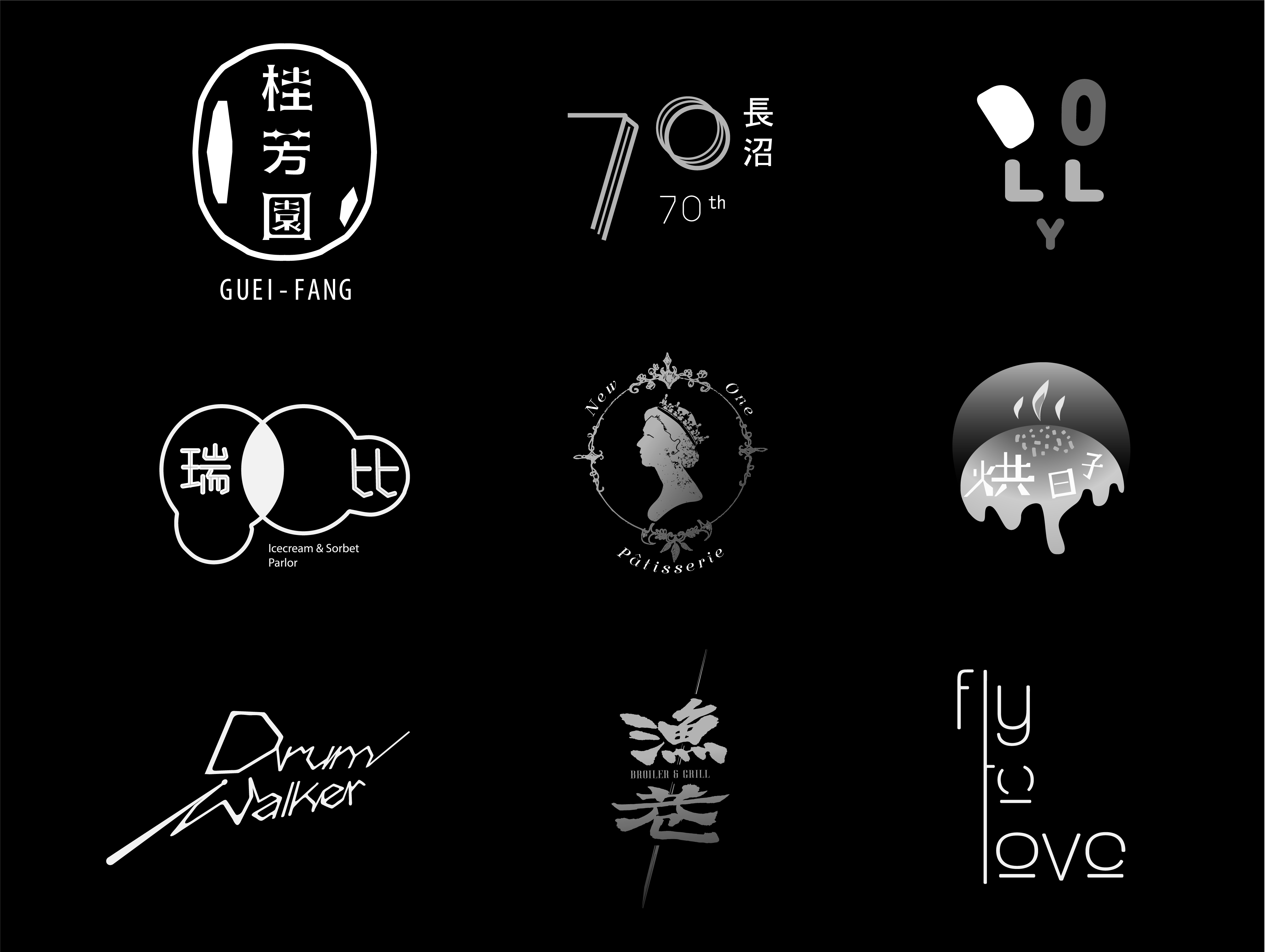
As the core value of this cake shop, logo design denotes noble symbolism. With featured "simple" imagery and a suitable "serif typeface, " the logo is inspired by European copperplate engravings from the 15th and 16th centuries. Queen in a crown, implies the identity of the character. Instead of the profile silhouette turned to the right, of full horizontal and 90° sides, it ended up being a 45° side, making the icon much more extraordinary and elegant.
這個標誌設計希望帶給人高貴的感覺。透過「簡單的」圖像, 搭配適當「襯線字體」作為風格進行設計。靈感來自於歐洲十五、十六世紀的銅版畫, 總是給⼈一種傳統卻高級的感覺。中文店名中的「女王」, 我選用一個轉向右側面的剪影, 戴著皇冠, 暗示著角色的身份地位。取消「全橫向」、「90° 」側臉的角度, 約為「45° 」的側臉讓人更有一種典雅卻十分霸氣的感覺。


