Client | Yu Xiang Izakaya
Flyer / Layout | Kim Huang
Name Card | Kim Huang
Lantern / Stencil / Silk Print | Kim Huang, Hisn Han Huang
Jul. 2017
“ Yu-Xiang ”, is a Japanese-style bistro ( referred to as “居酒屋, Izakaya” in Japanese ) that is located in a hidden alley. The owners are very young, but with a dedication to the food, they go to the fish market every morning to prepare the ingredients so that their foods are fresh and delicious. And the price is very affordable.
漁巷, 是開立在小巷子底的一間不起眼的日式燒烤店。老闆和老闆娘非常年輕, 卻帶著一股對美食的執著, 每天凌晨早起去魚市批貨備料, 也因此料理的食材新鮮, 價格卻十分平易近人。
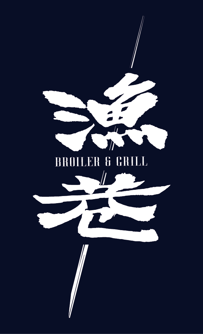
I used the two calligraphy characters “fishing ” and “alley” in Chinese, which are like “real” fresh vegetables or meat, stuck together from the bottom left to the top right so that they can remind of what the store is selling. The combined images of Taiwanese and Japanese look down-to-earth but unique.
我將「漁」和「巷」兩個書法字,像是具體的新鮮蔬果或肉類食物,由左下至右上串燒再一起, 讓字體能直接讓人聯想到這家店賣的是什麼。而看似台日兩種風格不一致的圖像,互相融合出一種似曾相似的親切感,卻又獨樹一格。
The small unit pattern comes from the “baked grain” after grilling foods, and the outline is like the “fish” in hieroglyph( a character of the ancient writing system, Wikipedia). This pattern is very suitable for repeated arrangements.
搭配的小單元圖騰, 來自於美食炙燒後的「烤紋」, 而造型輪廓上又像是象形文字中的「魚」。這種圖案很適合重複排列。
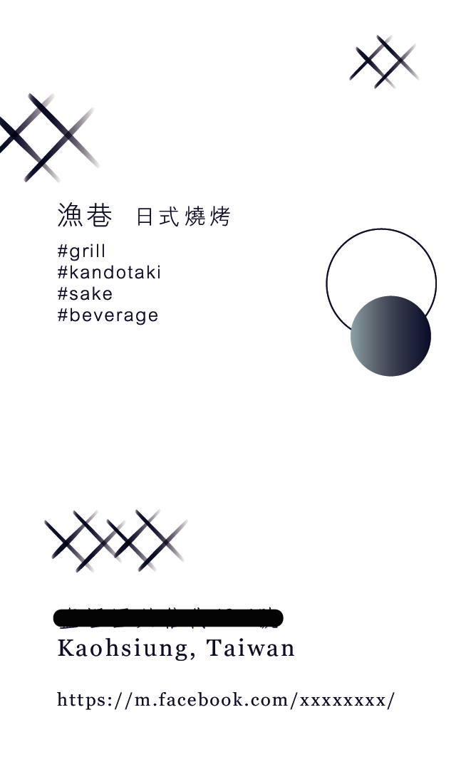
Because of the concept of “affordable, fresh, and high-quality cuisine”, I hope to create an avant-garde CI, but close to the consumers. The system is widely used, such as in lanterns and business cards. So, the point is flexible and highly readable.
也因爲這「平價享受新鮮高品質的料理」的理念, 我希望透過設計做出具有高級感卻意外地親民的反差感。於是, 我從讓人能直接聯想到日式風格的「家徽」開始設計起。設計的運用十分廣泛, 大至燈籠布簾, 小至名片標誌等, 能夠自由變形且保有一定辨識度的圖案就是考量的重點。


