Client | National Science & Technology Center of Disaster Reduction ( NCDR )
Web Wireframe / UX | HY Web Technology corp
Illustration / Icon Design / Storyboard | Kim Huang
Exhibition board layout | Kim Huang
Souvenir / Magnent | Kim Huang
Video Motion Graphic / VFX | Yen An Chen
Adobe Illustrator / Photoshop / After Effect / Premiere
Sep. 2016
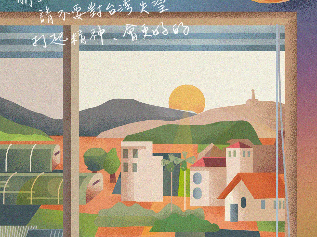
This project consists of one set of disaster web pages, one kind of gift, and one promotional video for public information campaign embedded online.
For this project with a wide range of VI systems, I collaborated with National Science & Technology Center of Disaster Reduction ( aka. NCDR), which is a committee that contributed to disaster prevention, assisting in policies, educating people about the topography of surroundings and formation of disaster, providing immediate information.
As a VI, UI designer & storyboarder artist, I worked closely with HY Web Technology corp.
這是首次與政府機關合作的成果,並協同網路科技公司——凌網科技。國家災害防治中心一直致力於災害整備、協助應變政策、以及教育民眾對於各地區的地形認知、災害形成並提供即時的災害資訊。
The purpose of this webpage is not only to expand the good use of government disaster mitigation planning but also to enable people to understand the incidence of disasters by searching past cases or terrain/topography near houses.
本網頁的目的不僅是為了政府減災規劃的使用,也讓人們通過搜索過去的案例或房屋附近的地形,來了解災害的發生。
At the beginning of this design, we also referred to the “Tokyo Disaster Manual (東京防災 )”, in which the illustrations or signs were as simple as possible and designed suit for children so that the children and parents can practice in lives easier.
在設計之初訂定設計方向時, 我們也曾經參考「東京防災手冊」, 從中我們發現書中在插畫或標示上盡量以簡單、富有童書般的畫風,考量讓學童、家長們能更容易從生活中力行。而這個網站的目的,除了為了政府減災規劃使用, 也可以讓民眾透過查詢過去案例或自家附近地形了解災害發生率。
Source of inspiration | 東京防災
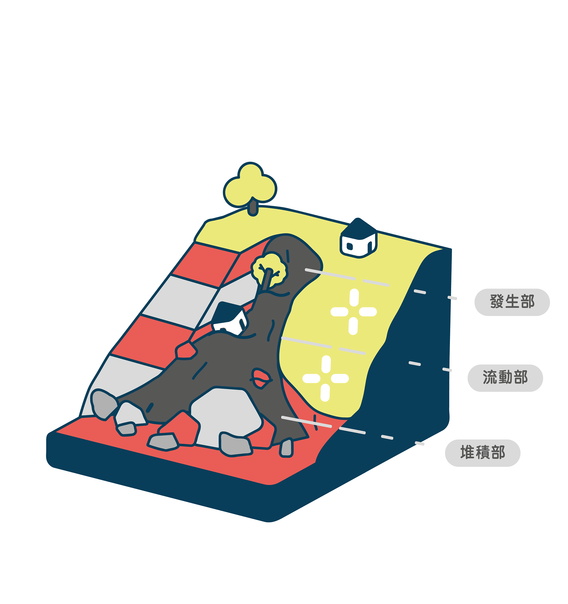

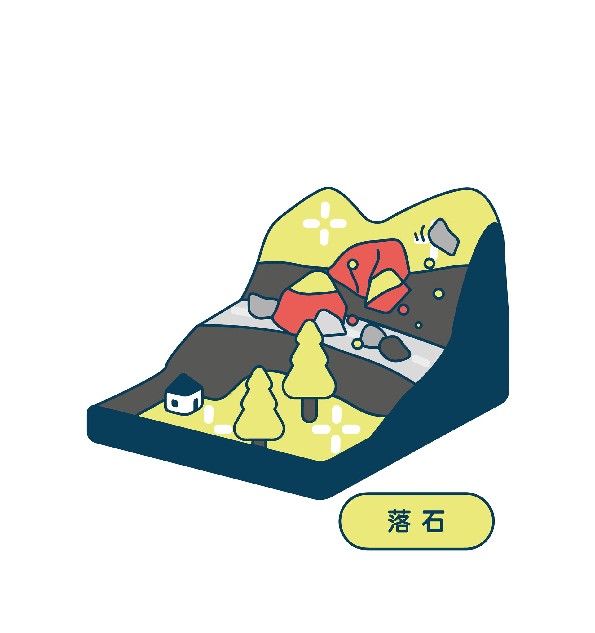
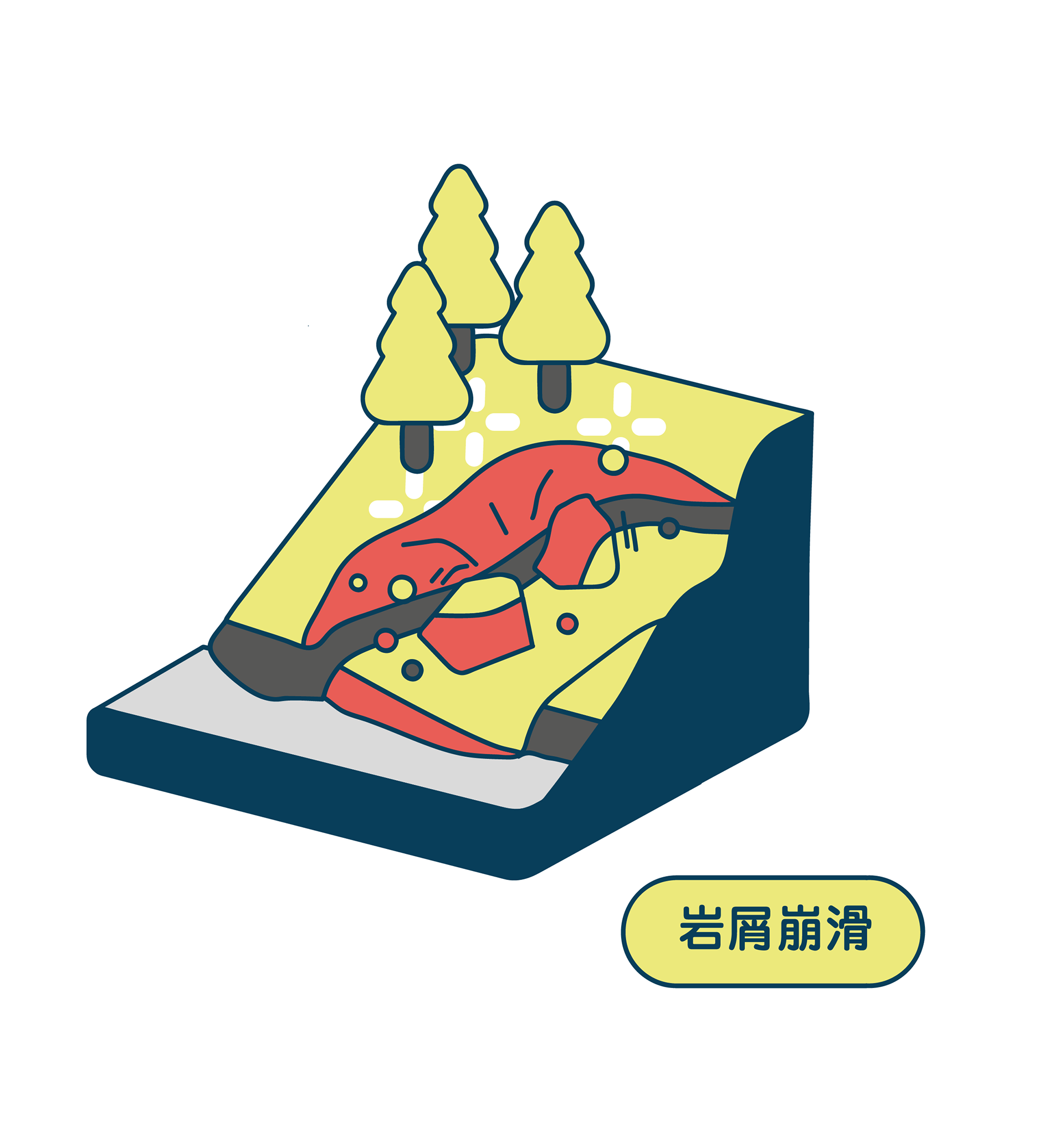
Therefore, I hope that the images on this site can greatly enhance the interests and curiosity of the audience, and simplify redundant information with a series of politically correct infographics.
So, I break down the style into "rounded, vivid, gentle tones".
因此我希望可以在有限的架構、內容資訊正確的情況下, 讓網站中的圖像能讓使用者在新鮮度上大大提升, 簡化枯燥過冗的圖表資訊。我拆解出「圓潤、鮮明、色調的統一」。
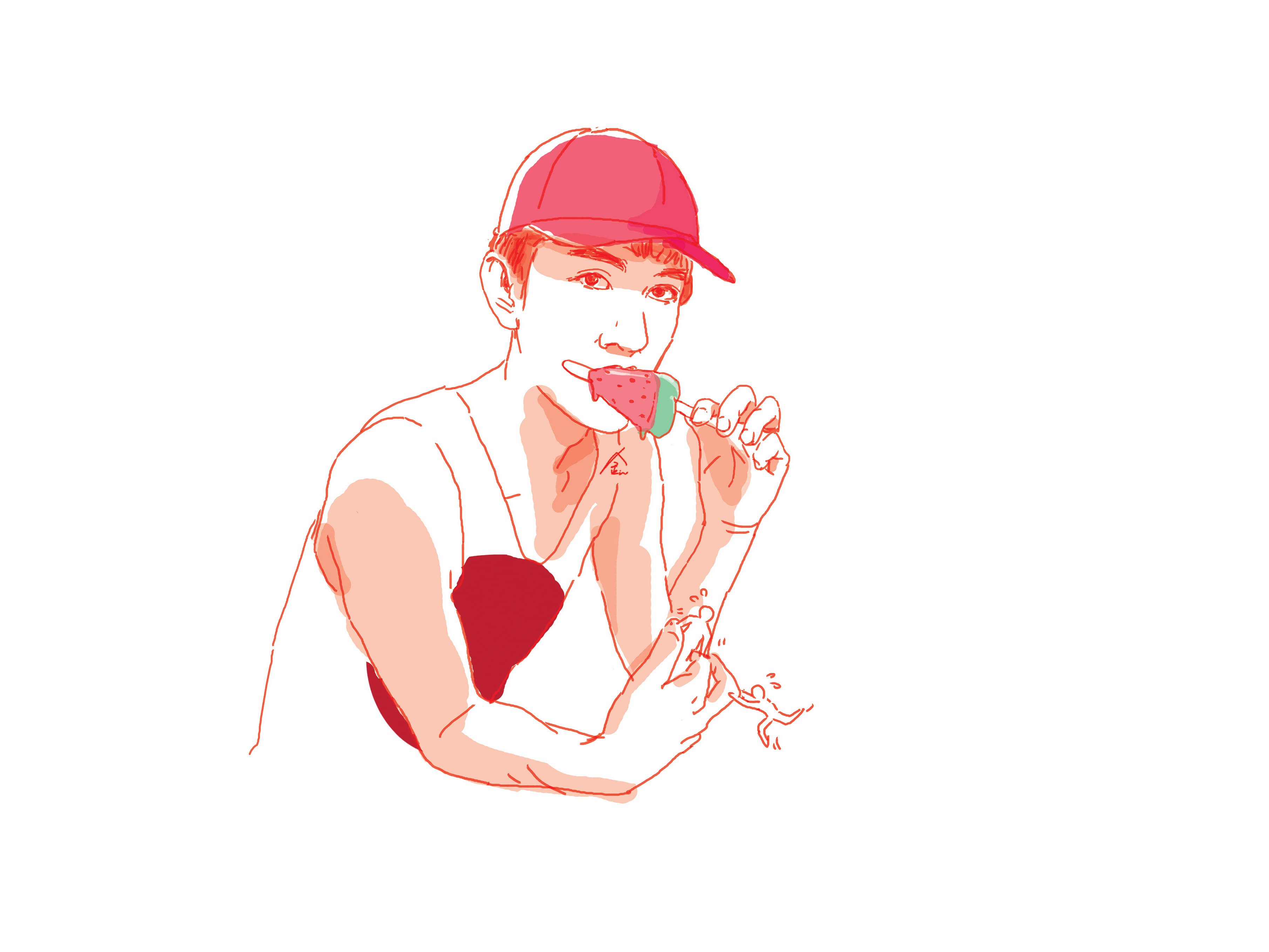
You may notice the "not alive" terrain and topography with some "expressions". However, "Alive" residents do not have any facial features put on their faces. The reason is that I would rather put emphasis on the prevention of disaster than the strong feeling of tragedy. The cause of the disaster itself is actually "innocent".
We should always be well-prepared and conscious of disaster prevention.
值得一提的是, 地層、板塊為主的「無生命」圖案我使用了一些「表情」, 「有生命」的住民則沒有任何五官, 除了抽離災害悲慘的真實性呼籲正視預防的重要之外, 還有事件「主體」本身是其實是「無辜」的。
我們應該時刻做好防災準備和意識。


