Client | NIKE NXT Team (NXT Design Assets)
Project Concept | Henry Ortega, Aiwen Fu, Kim Huang
Source of inspiration | NIKE
NXT Design Assets
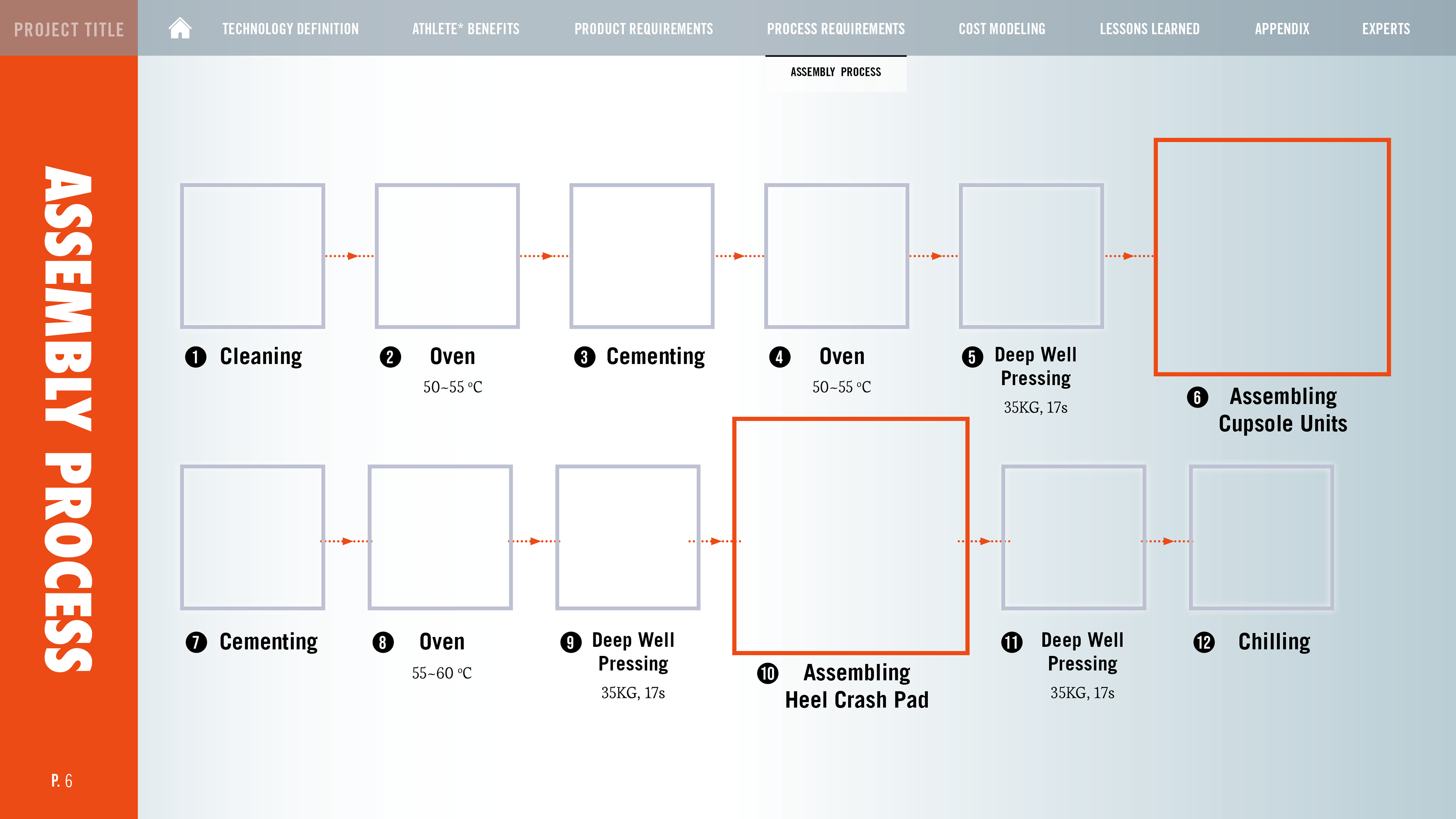
I committed to designing a series of design assets for NXT Team documentary. I just tried many different layouts and thought if we could narrow down on which design direction we really help both our audience and designer based on the template designs. So I started to build the elements for 3 different design systems with documental requirements including icons, buttons, navigation bars, and backgrounds across the teams.
Special thanks to Aiwen Fu as my expert who gave me some clear direction to sort after brainstorming. And after that, WHQ VCT chose option 1 as the final template to apply to 4 PICs.
這個專案,我負責執行發想設計出幾款不同的樣板(Template),來提供給包含NIKE 總部和亞洲區四間工廠的技術手冊使用;須考量提供給設計師設計與技術人員觀看的便利性與易讀性。
起初我先設計了三款不同的方向作為視覺設計團隊的參考,再由團隊挑選出其中一款為後續的延伸設計。設計中包含辨識圖標、具有連結功能的按鈕、和選單等等。
很感謝愛文作為我的協助夥伴,提供我很多方向當我發散大於收斂時。最後團隊選擇第一個版本作為最終的樣板提供給其他團隊。
OPTION 1
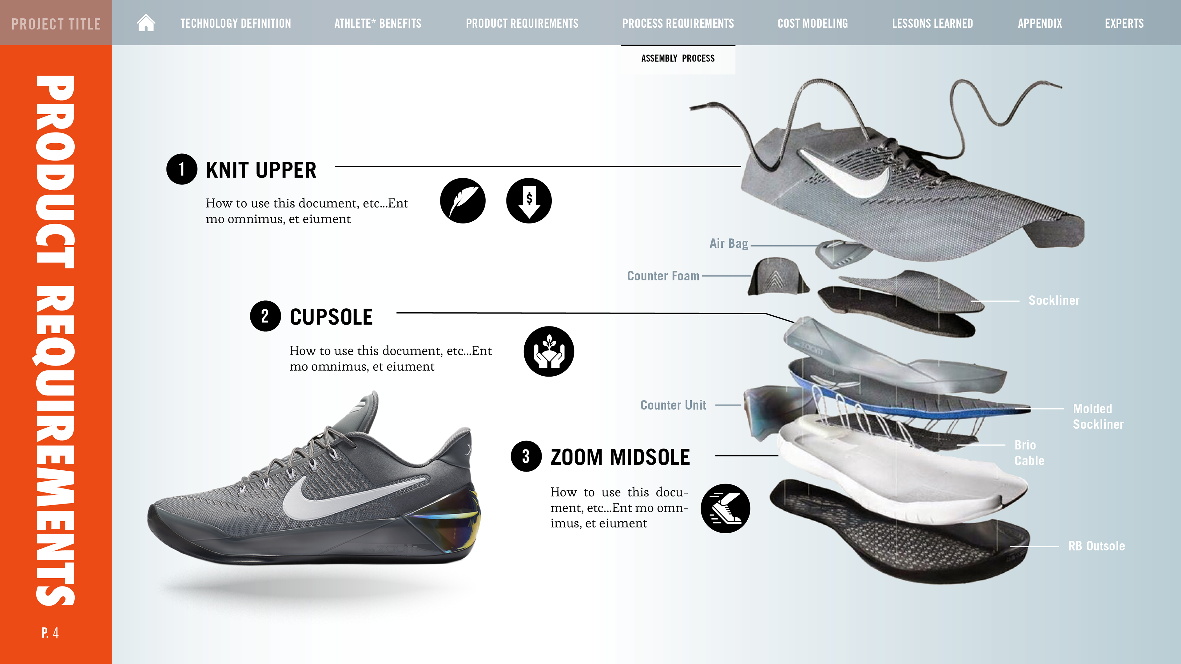
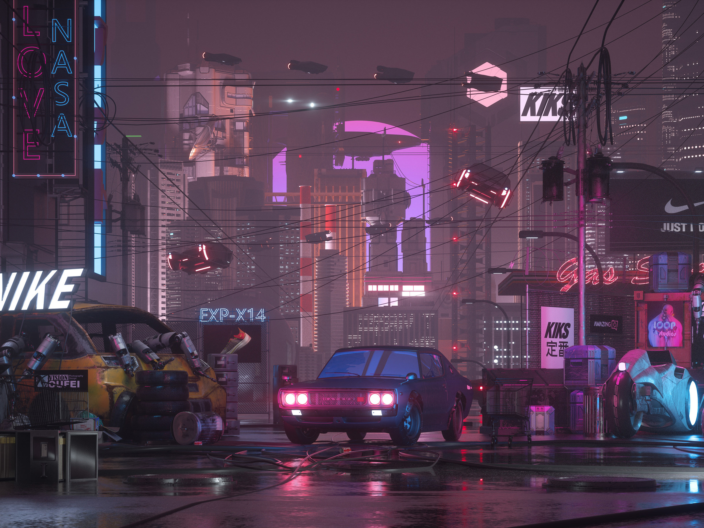
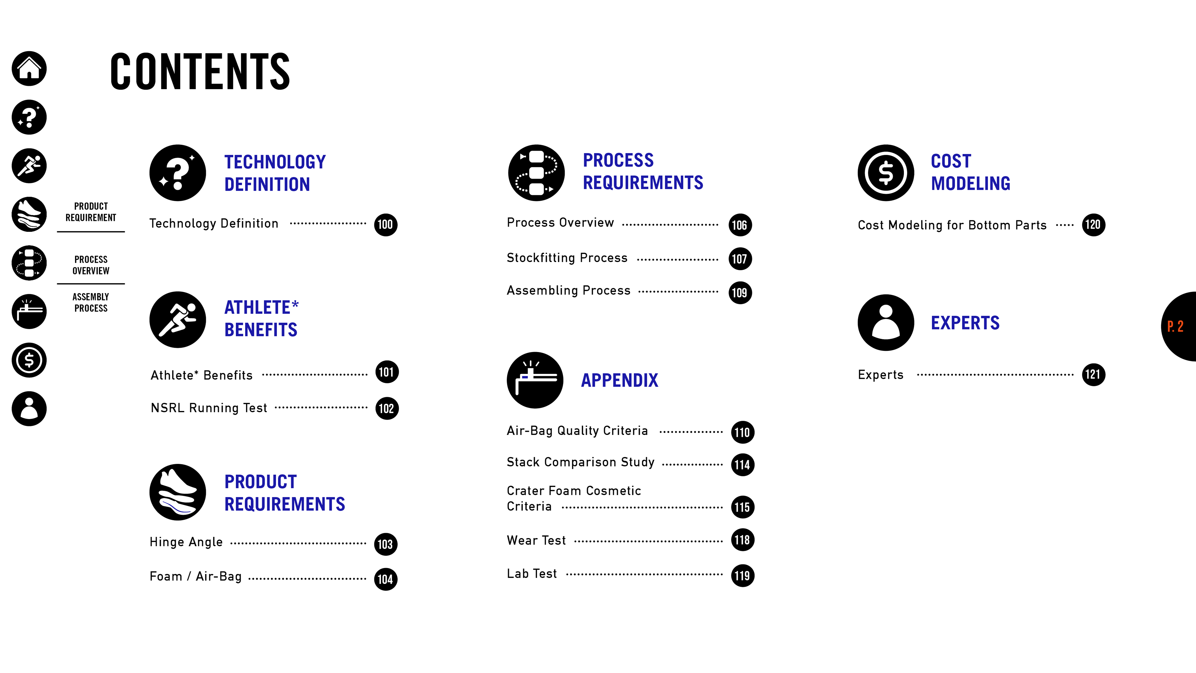
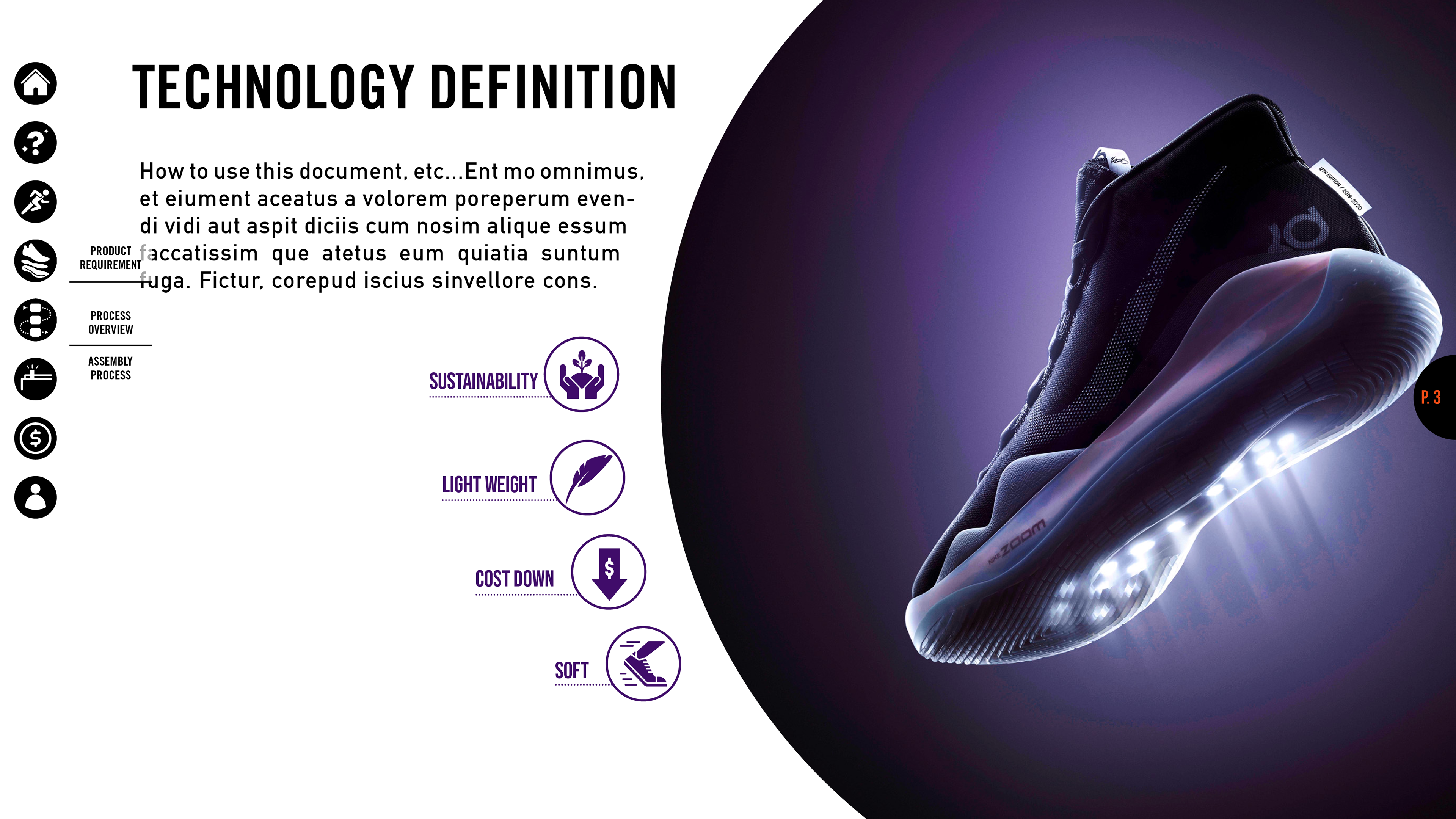
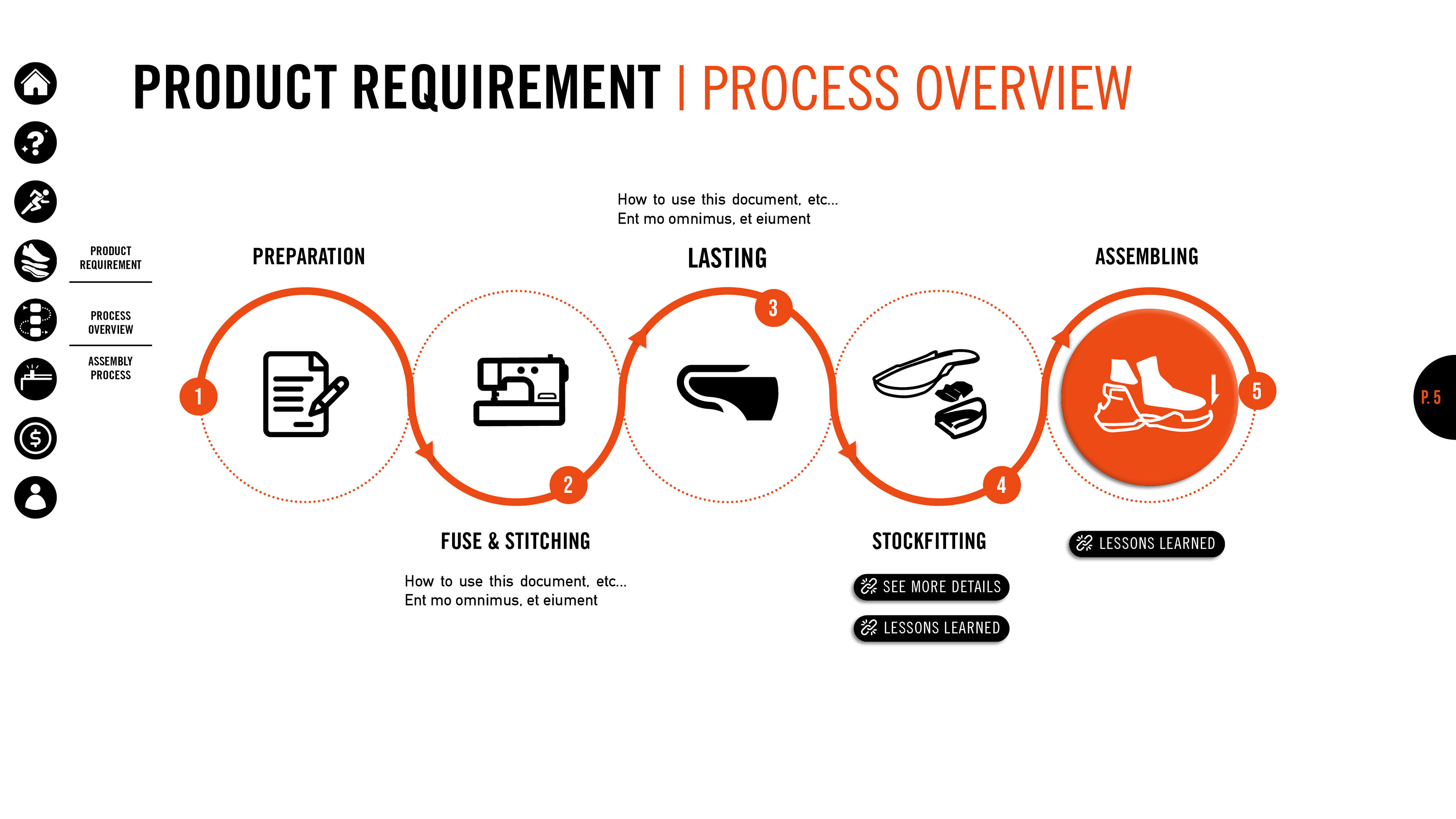
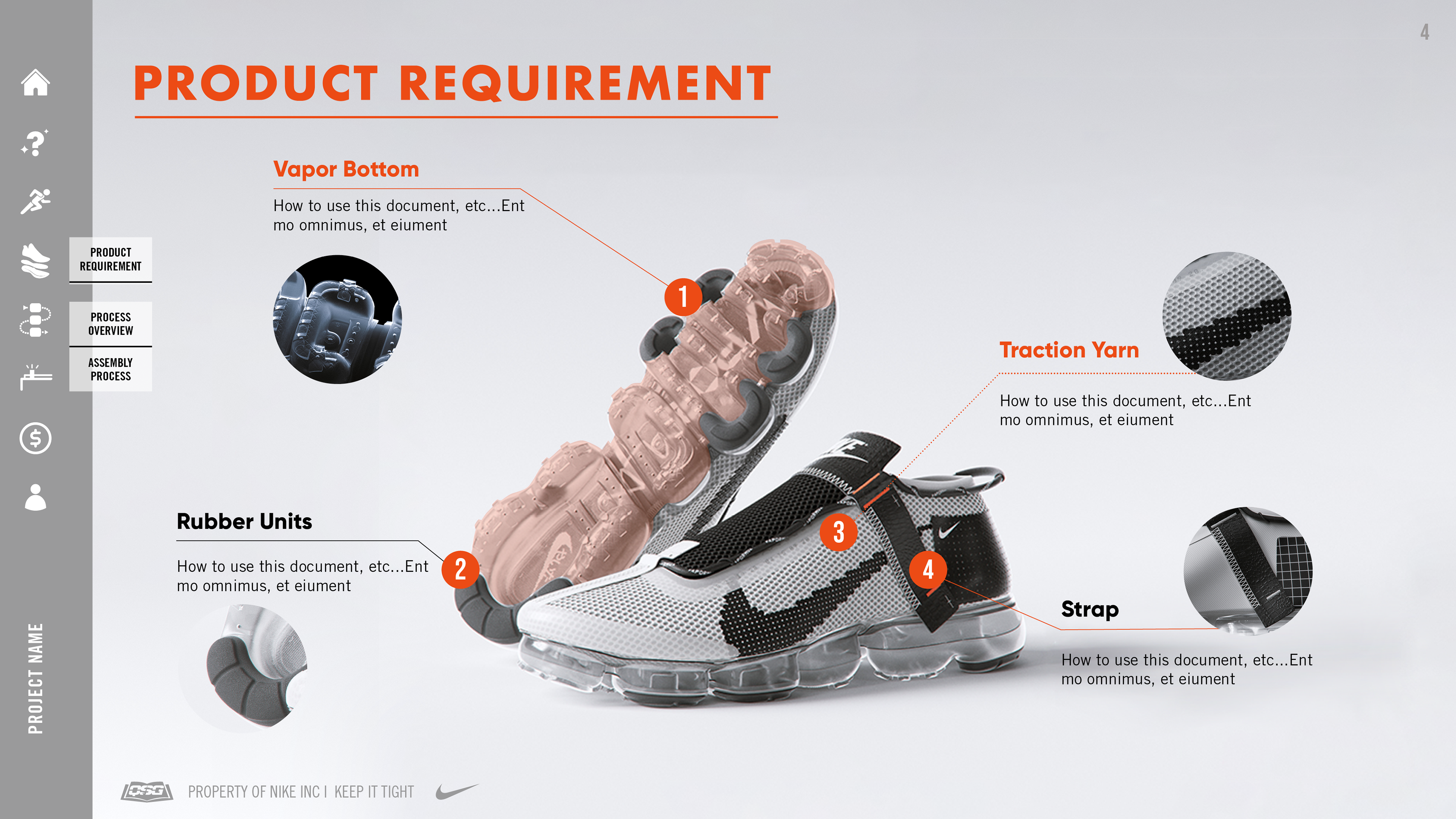
Futuristic design ideas were applied when working on design template 01 throughout the pages. The navigation bar was developed using icons on the left-hand side for users to easily navigate through the pages. Special rollover with details of shoe images was applied especially on the product requirement page. (P4) The dedication of this design is to make the users interested in reading it.
模板01
在設計模板 01 時,我應用了未來主義的設計理念。 導航欄是使用左側的圖標開發的,以便用戶輕鬆瀏覽頁面。 在產品需求頁面上,特別運用「Roll over」滑鼠觸發時會帶有球鞋圖像細節的特殊功能。整體的設計希望可以讓觀者有高度的興趣閱讀。


OPTION 2
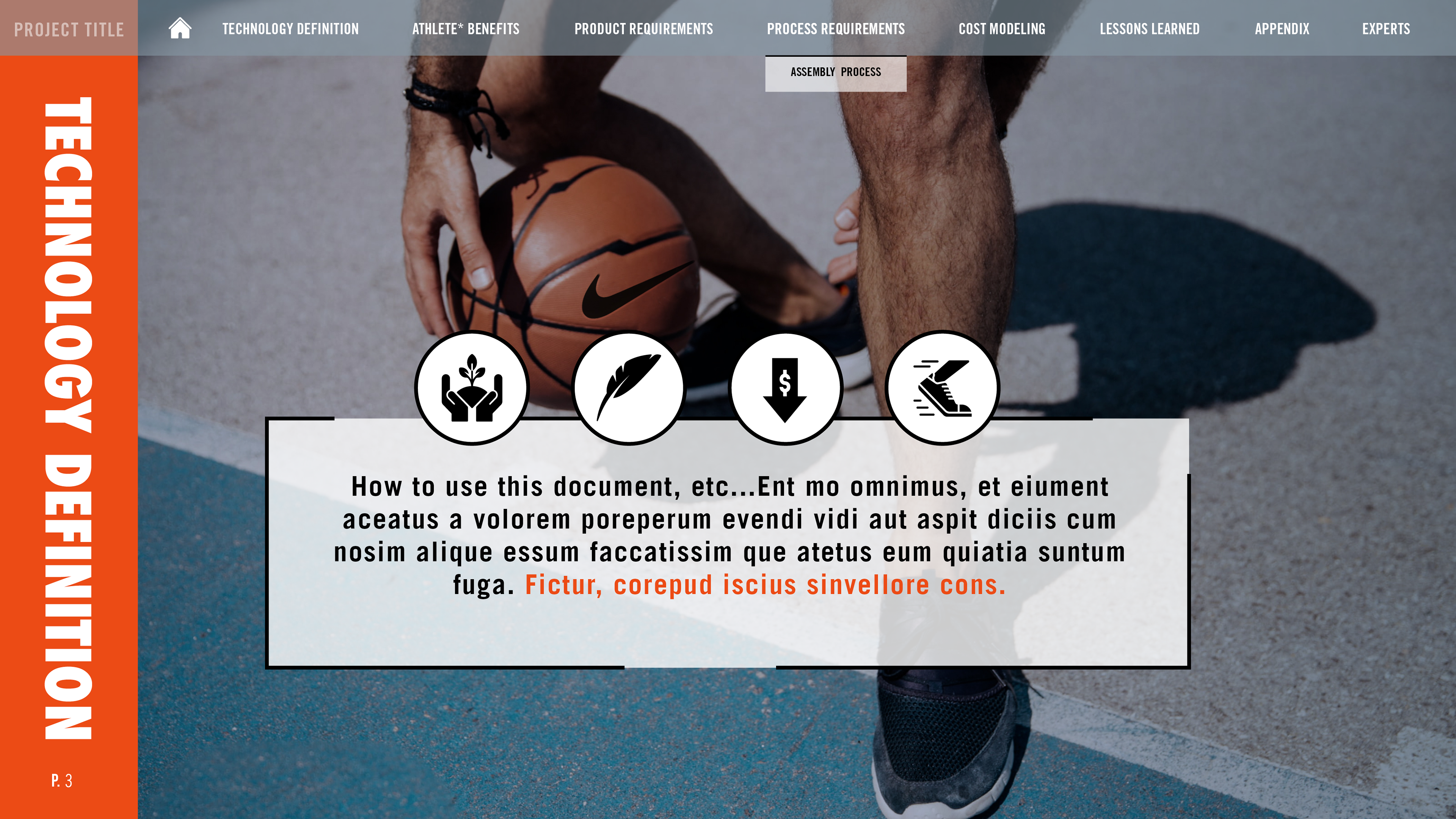
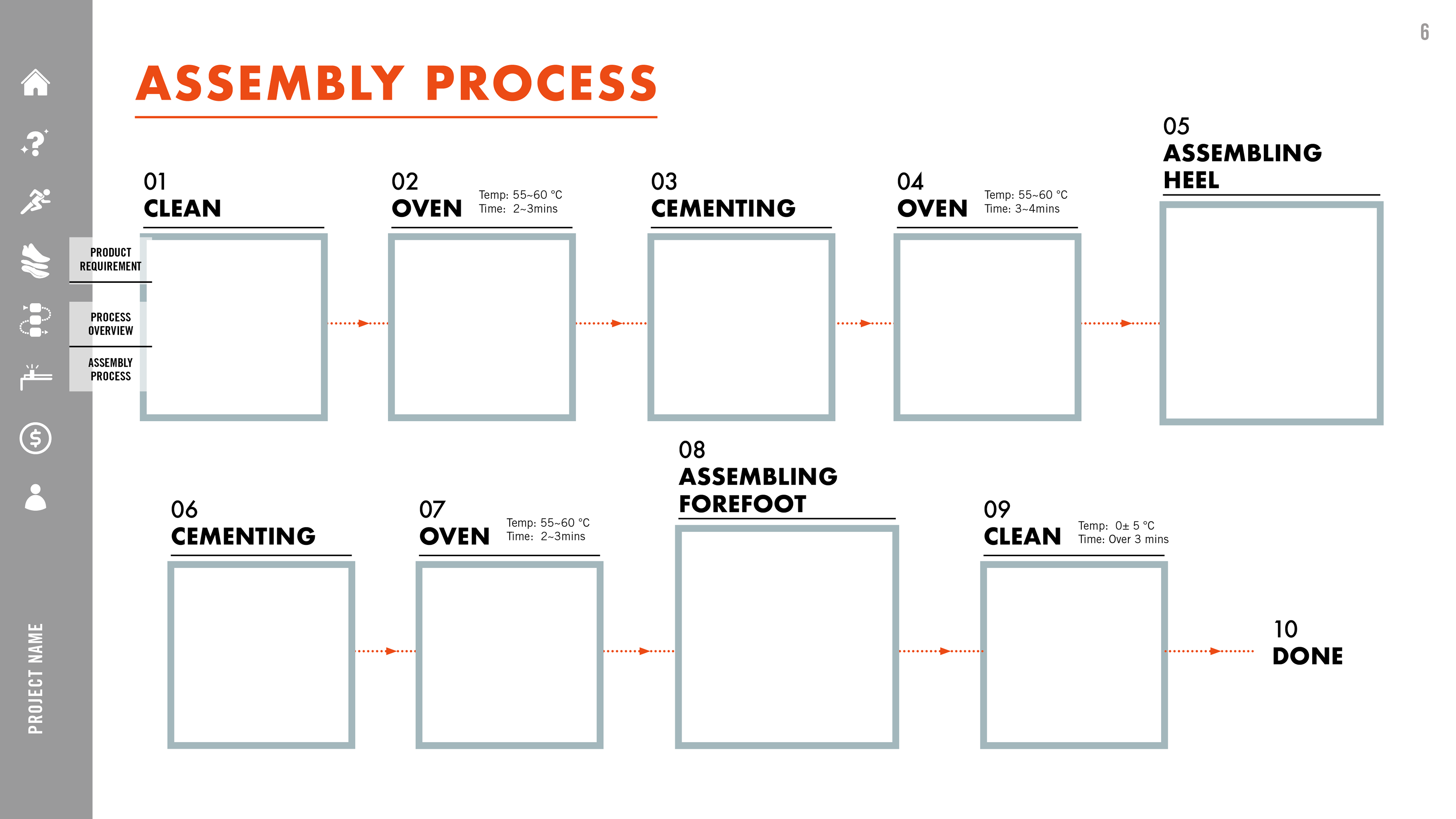
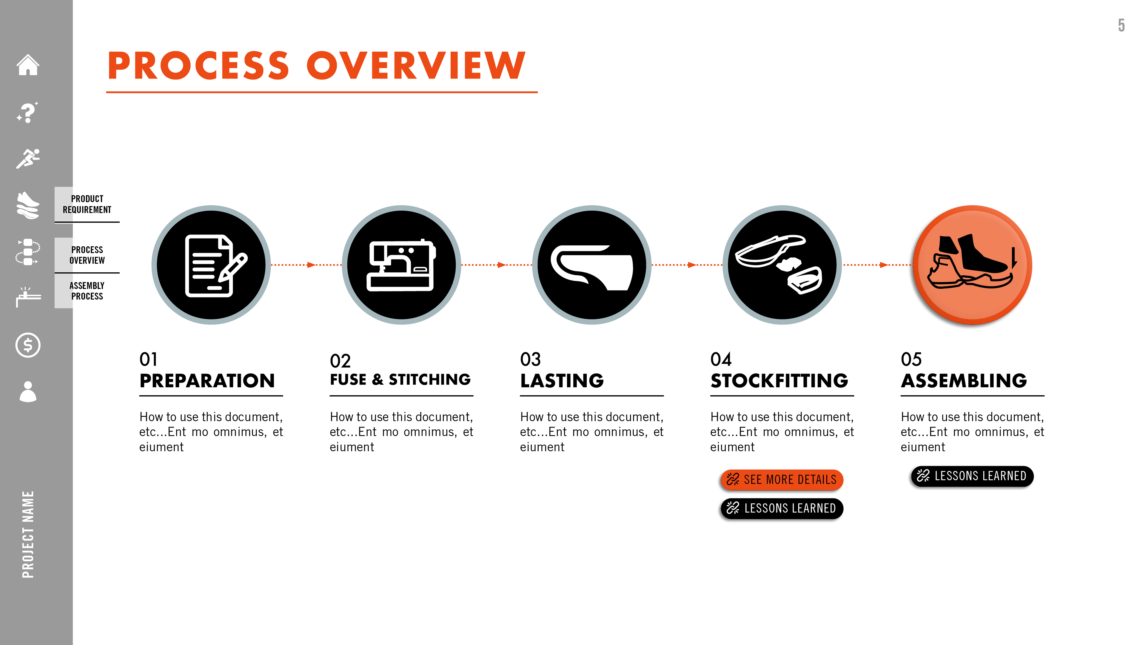
2 concepts were developed with differences of 1 navigation bar on the top and 1 on the left-hand side to follow the theme with Will’s design template. These 2 concepts were more in the corporate style with sports images applied throughout the pages.
模板 02
運用更多方正規矩的元素,更具有企業風格。導航欄延續模板01的概念,也是在左側提供技術手冊內容更大的空間。產品需求頁面更直觀的觸發圖像會顯示在對應的Callout 說明文字旁邊。


OPTION 3
Combined the concept with 1 navbar on the left-hand side to follow the theme with Will’s design template. The design ethos is more similar to UI design system for the web with a drop-down menu. The product requirement page only used icon graphics and descriptions for clear product features.
模板 03
結合Will 設計的風格,並將導航欄移動到上方的位置,提供觀看者近似於網頁下拉式選單的操作模式。產品需求頁面則使用單一icon和文字敘述明白詮釋產品特色。

